
Goal Setting
1Defining your goal ensures your product objectives align with your organization.
The infrastructure your product runs on. Components, tokens, and patterns—live, connected, and in context for your team and your users.
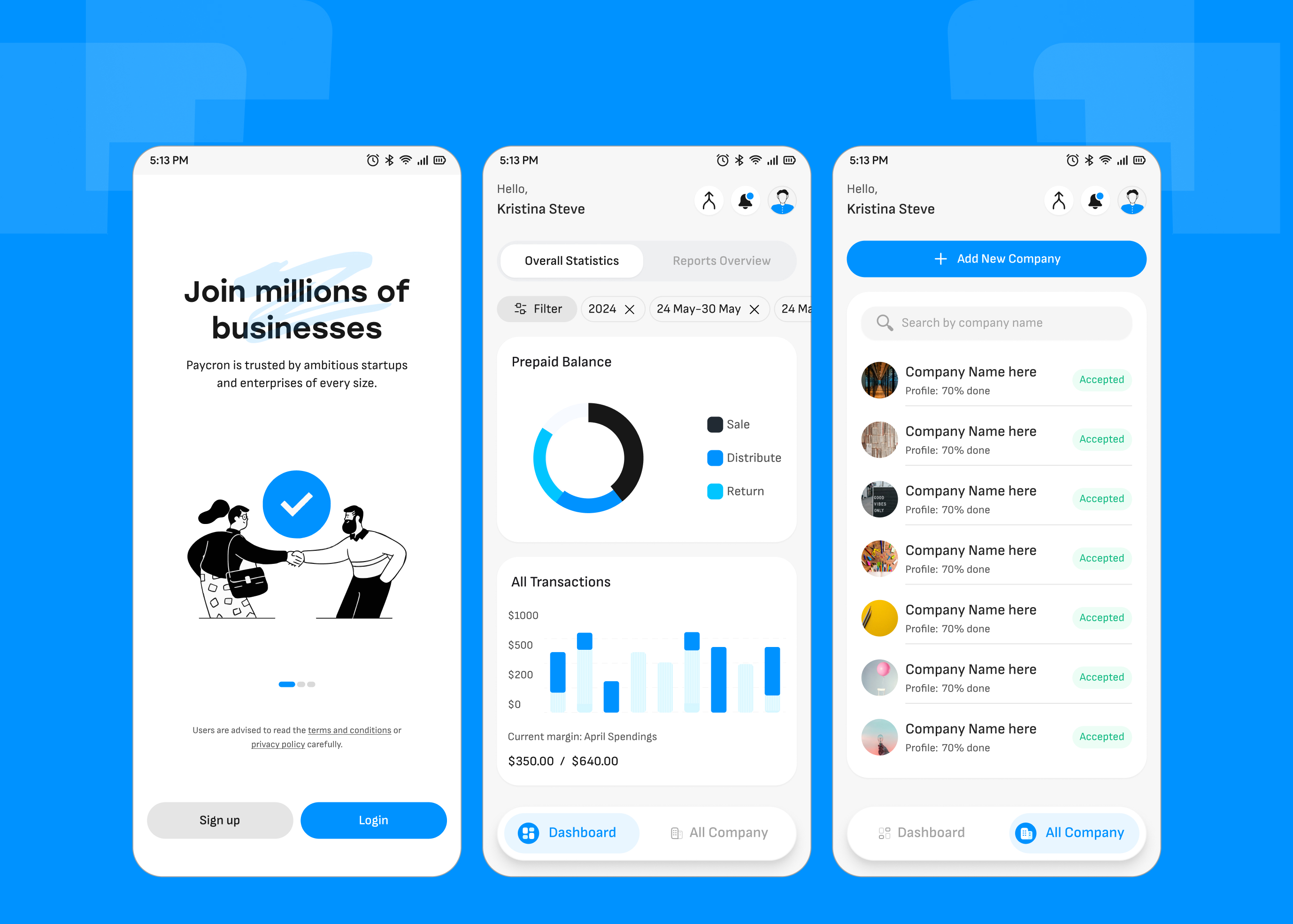
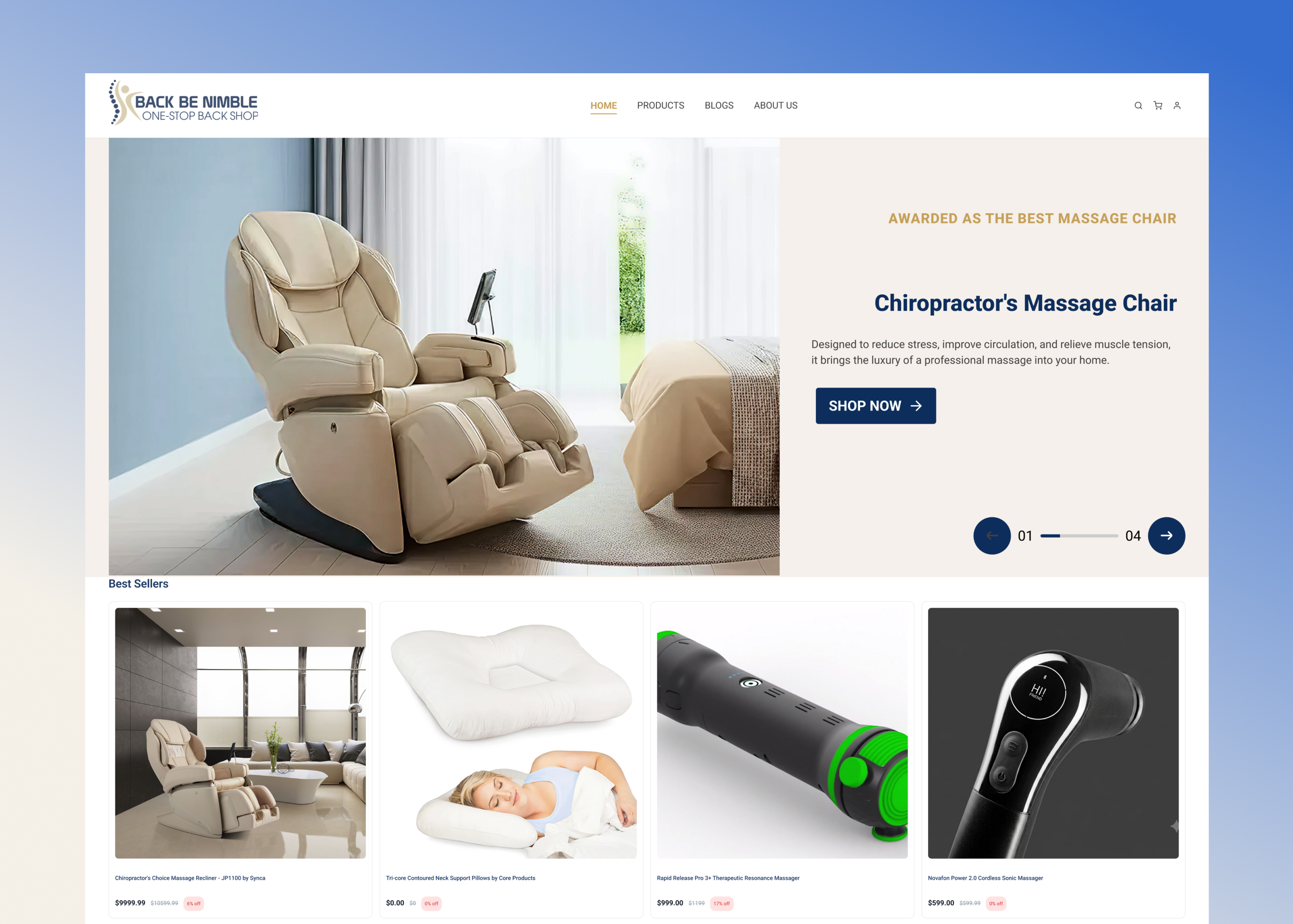
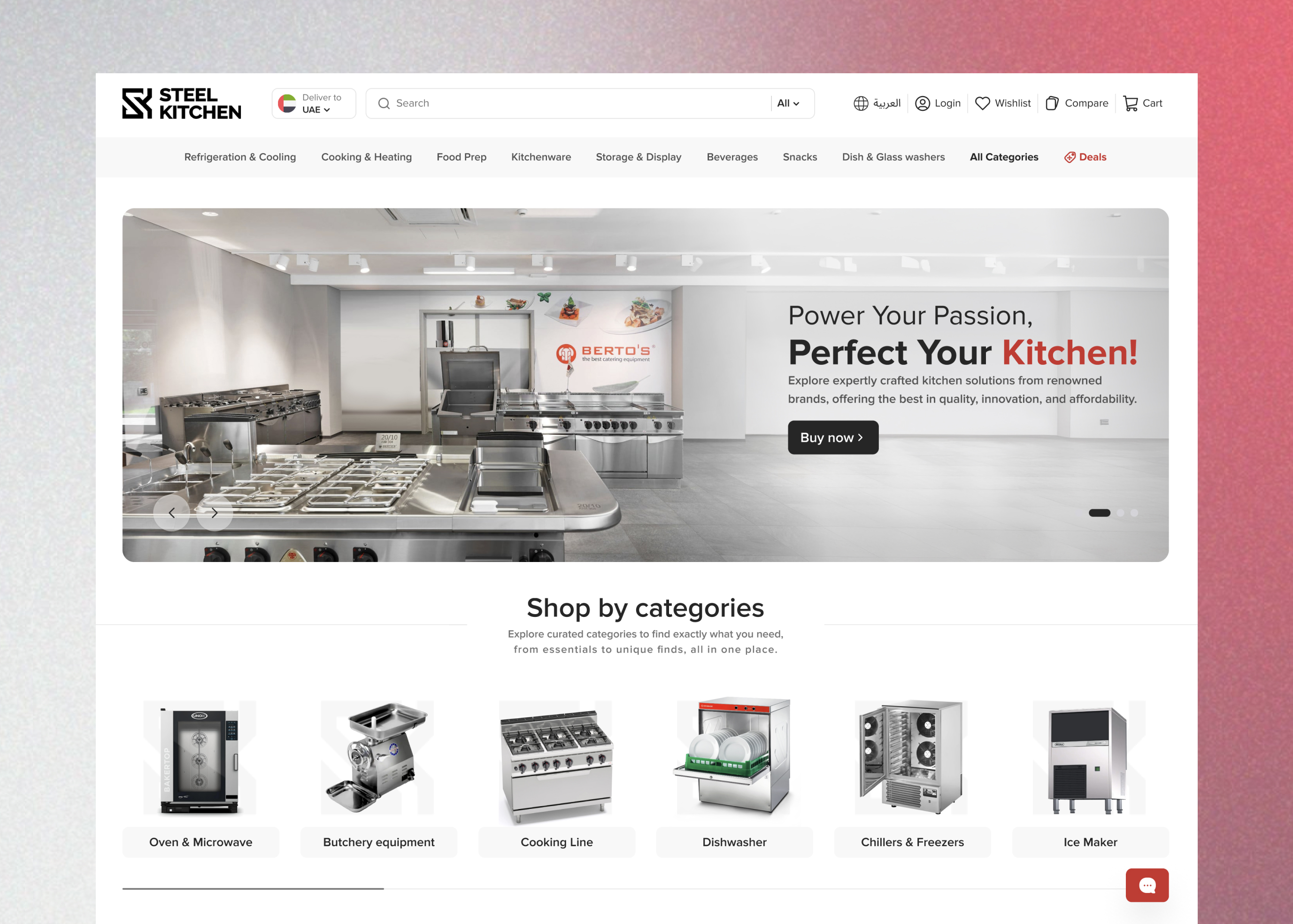
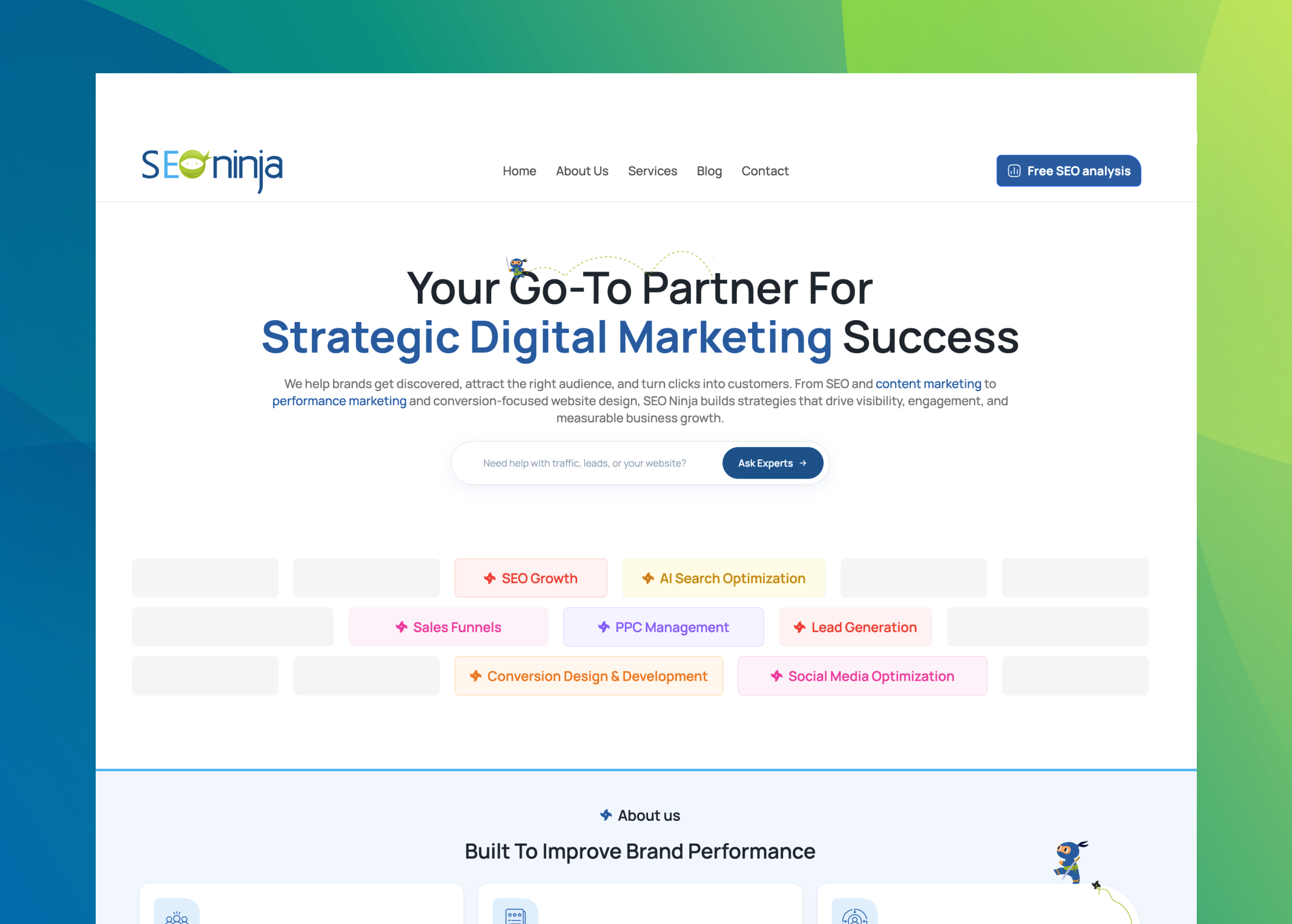
We design result-driven apps, 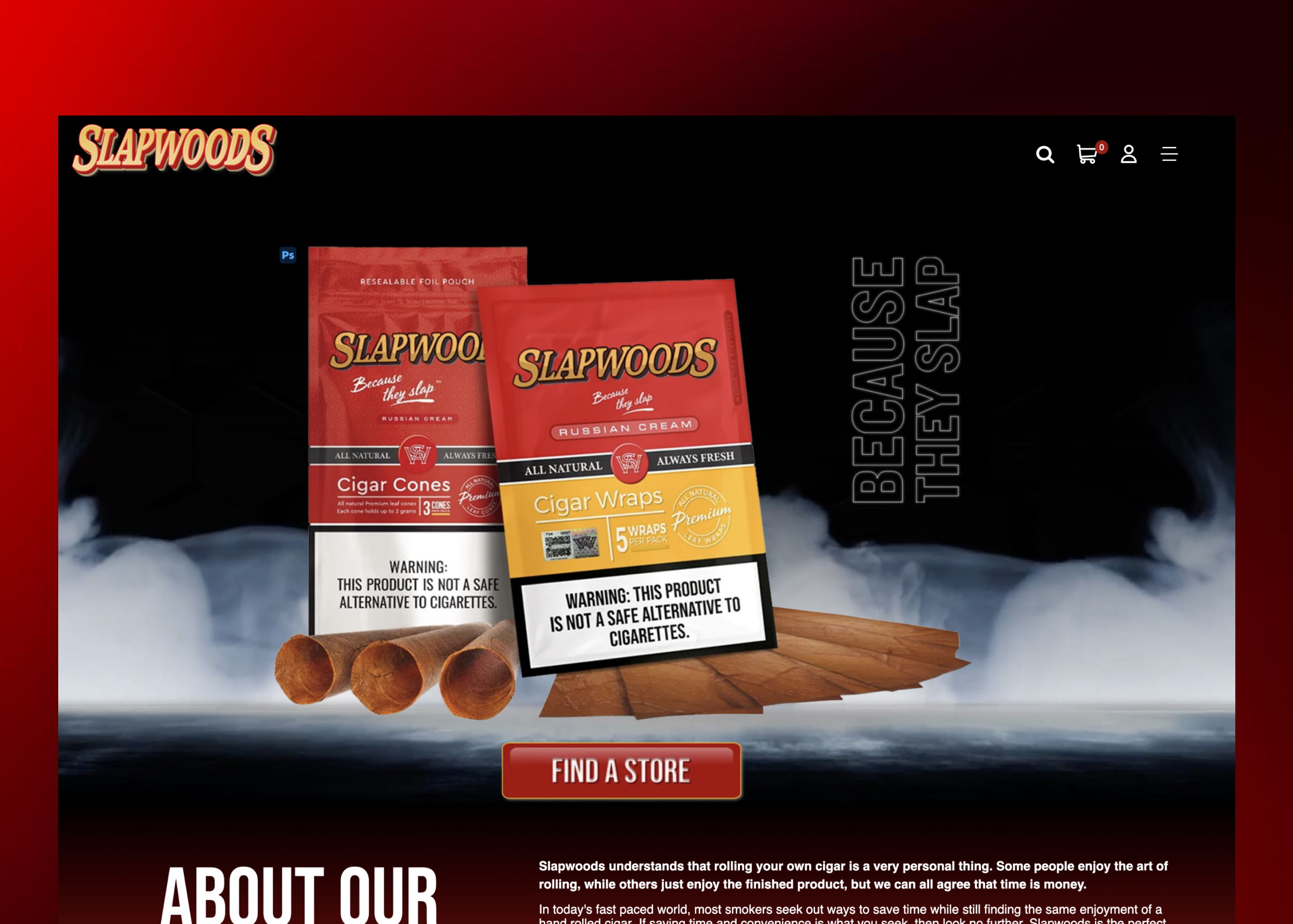 websites
 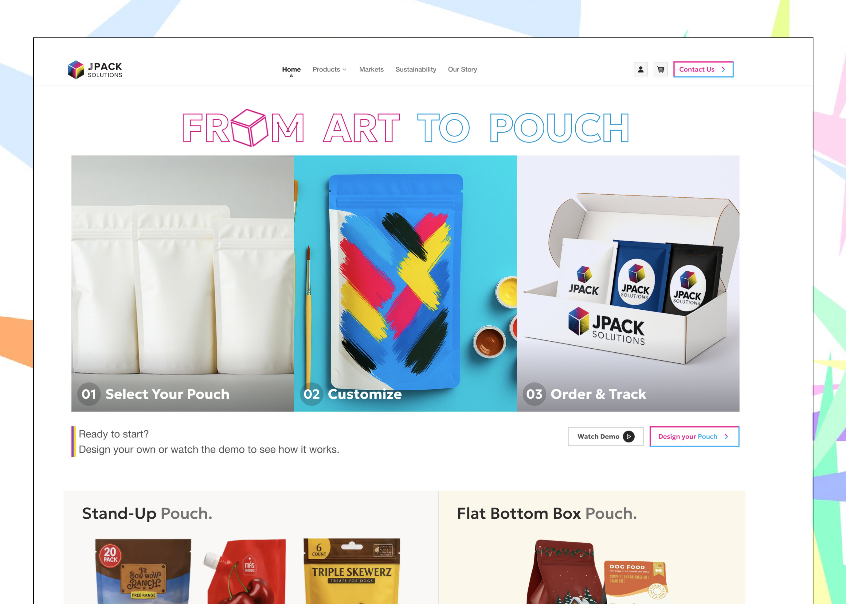 and brands
 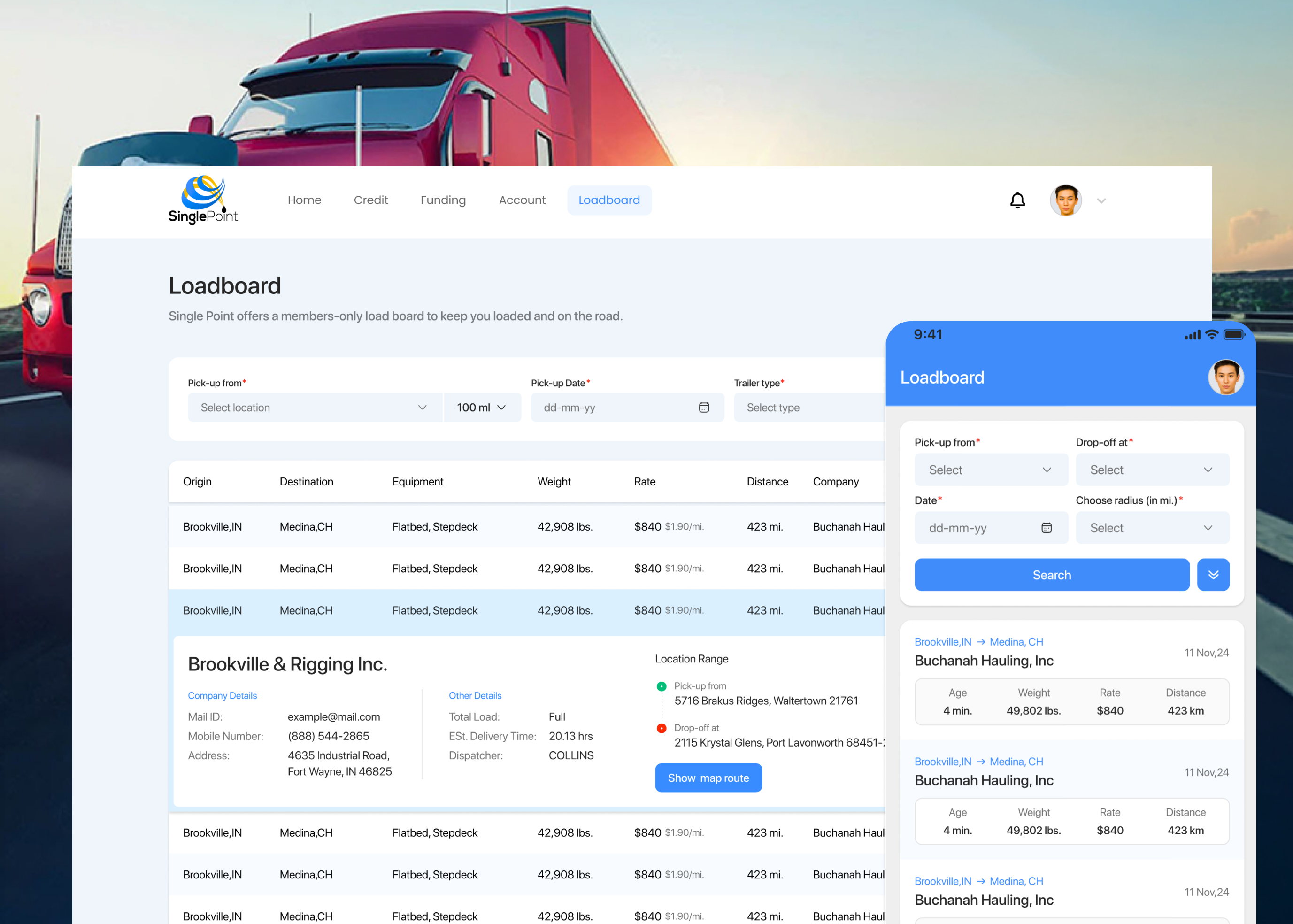 for globally recognized companies and early-stage startups.
Three forces fight for every pixel—and only one ever earns it.
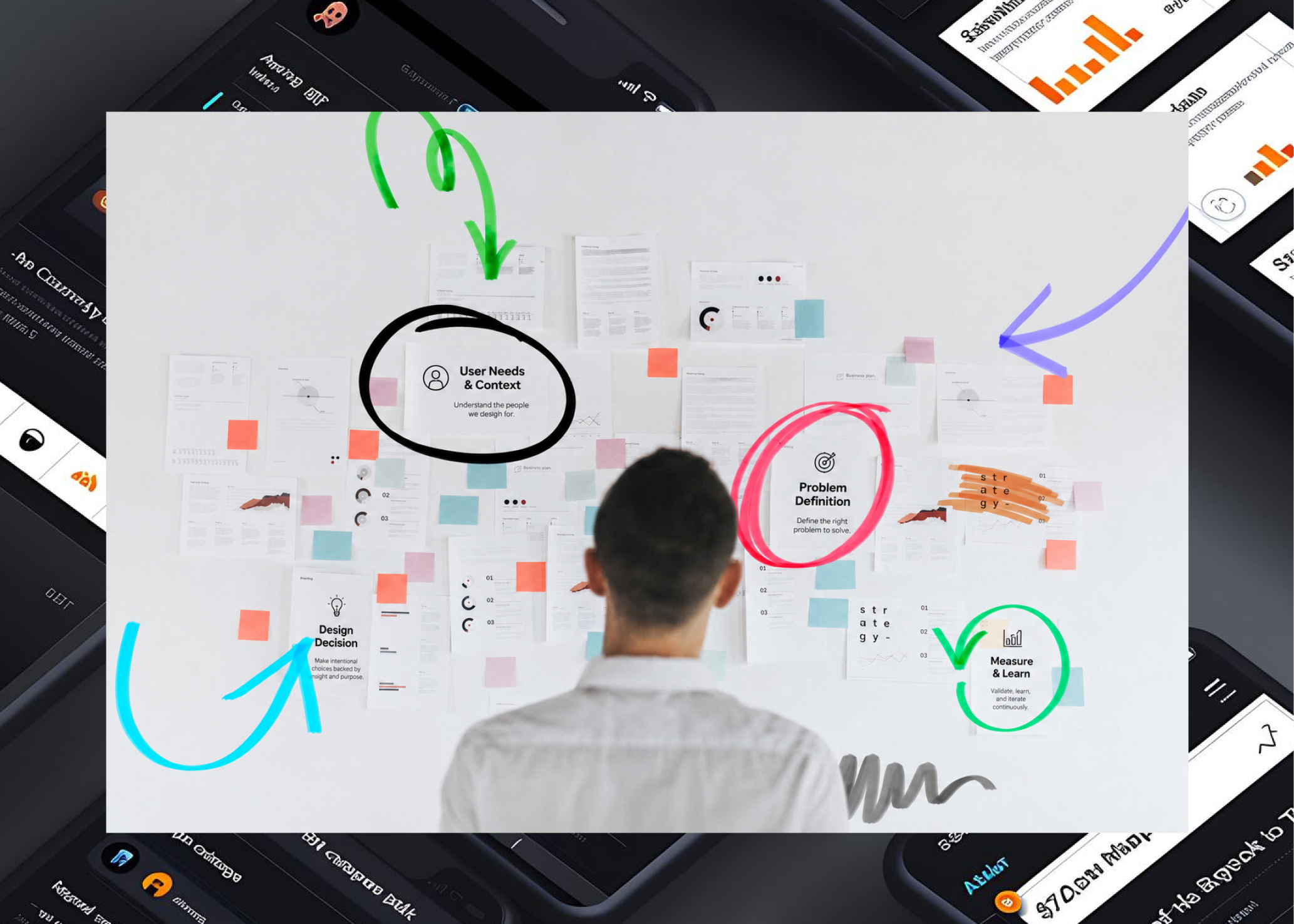
Defining your goal ensures your product objectives align with your organization.
Gathering information and data-driven insights help inform the design process.
By turning data into insights, designers can better understand their user base.
The product team proposes a design strategy to achieve business goals.
Tracking efforts toward the long-term goal of bringing the product to market is the final decision process stage.
Goals, market scan, and the problem worth solving.
Interviews, personas, and journey maps.
Low-fidelity structure, pressure-tested.
Information architecture and flows.
High-fidelity UI and a scalable system.
Clickable, motion-true prototypes.
Usability sessions and iteration.
Production-ready files and tokens.
Goals, market scan, and the problem worth solving.
Interviews, personas, and journey maps.
Low-fidelity structure, pressure-tested.
Information architecture and flows.
High-fidelity UI and a scalable system.
Clickable, motion-true prototypes.
Usability sessions and iteration.
Production-ready files and tokens.
Type, color, components, and tokens that keep design and engineering speaking the same language. Go ahead—click around, it's live.
One spacing and radius scale keeps every layout on the same rhythm—tweak a token here and it ripples through the whole system.
Great experiences aren't a cost center—they compound. Here's the kind of impact user-centered design delivers across the funnel.
Illustrative figures based on typical engagements. Your baseline and targets are modeled up front, never promised blind.
“Plaxonic turned our tangled product into something users actually understand. Activation jumped within weeks of launch.”
Let's create intuitive products that users love and businesses grow with.